
Ecommerce Website Checklist: 15 Fixes Before the Sale Season
Use this ecommerce website checklist to find 15 conversion, UX, checkout, shipping, and performance fixes before your next sale season.
 Farhan PathanOctober 5, 20265 min read

Ecommerce Website Checklist: 15 Fixes Before the Sale Season
Sale season brings more visitors, more product searches, and more buying intent.
But more traffic does not automatically mean more sales.
A slow page, confusing product information, hidden shipping costs, or a broken mobile checkout can turn ready-to-buy visitors into abandoned carts.
Before your next sale campaign goes live, use this ecommerce website checklist to make sure your store is ready.

1. Check Your Website Speed
Customers do not want to wait for a product page to load.
Check your homepage, category pages, product pages, cart, and checkout on both mobile and desktop.
Look for:
Large image files
Unnecessary scripts
Slow third-party apps
Layout shifts
Slow-loading fonts or videos
A faster store creates a smoother buying experience and gives visitors fewer reasons to leave.
2. Use High-Quality Product Images
Your customers cannot physically touch the product.
Your images have to do that job.
Make sure every important product has:
Multiple product angles
Clear close-ups
Lifestyle images where useful
Consistent image quality
Zoom functionality
Mobile-friendly image sizes
The goal is simple: customers should understand what they are buying before they even read the description.
3. Make Product Titles Easy to Understand
A product title should tell shoppers exactly what they are looking at.
Avoid vague or overly creative names that hide the important information.
A good title should usually communicate the:
Product + key variation + important differentiator
For example:
Premium Cotton Oversized T-Shirt — Black
is more useful than:
The Essential
Clarity helps shoppers make decisions faster.
4. Make Pricing Impossible to Miss
Customers should not have to search for the price.
Show the current price clearly and make discounts easy to understand.
When relevant, show:
Current price
Original price
Discount percentage
Sale period
Important taxes or charges
Avoid surprising customers at checkout with costs they could not see earlier.
5. Put Reviews Where They Matter
Reviews are not just a section at the bottom of a product page.
Use them throughout the buying journey.
Show ratings near the product title and make detailed reviews easy to access.
Useful review elements include:
Average rating
Number of reviews
Written reviews
Customer photos
Verified-purchase indicators
Rating breakdown
Real customer experiences can answer questions your product description cannot.
6. Make Product Variants Simple
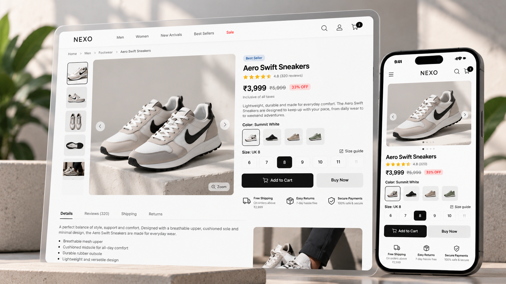
If your product has sizes, colours, materials, or other options, make the selection obvious.
Do not make customers guess which option is active.
Use clear:
Size selectors
Colour swatches
Variant names
Stock indicators
Availability messages
Also make sure selecting a variant updates the relevant product information correctly.
7. Make the Add to Cart Button Obvious
Customers should never have to search for the next step.
Your primary CTA should stand out visually and remain easy to access on smaller screens.
Use clear language such as:
Add to Cart
or
Buy Now
Avoid weak or ambiguous CTAs that make the action unclear.
8. Show Shipping Information Early
Shipping is one of the biggest questions customers have before buying.
Tell customers:
Estimated delivery time
Shipping charges
Free-shipping thresholds
Delivery regions
Express-shipping options, if available
Do not force customers to reach checkout just to discover when their order will arrive.
9. Make Your Return Policy Easy to Find
Customers want to know what happens if the product does not work for them.
Your return policy should be:
Easy to find
Easy to understand
Written in plain language
Clear about timelines
Clear about eligibility
Clear about refunds or exchanges
A confusing return policy creates hesitation before the purchase even happens.
10. Test Your Mobile Checkout
A large portion of ecommerce traffic comes from mobile devices.
So test the entire buying journey on an actual phone:
Product → Add to Cart → Cart → Checkout → Payment → Confirmation
Check for:
Small buttons
Difficult form fields
Slow loading
Unexpected redirects
Broken payment flows
Keyboard-related layout issues
Difficult address entry
A checkout that works perfectly on desktop can still fail on mobile.
11. Offer Reliable Payment Options
Customers should have a payment method they trust and understand.
Depending on your market, this may include:
Cards
UPI
Net banking
Wallets
Buy now, pay later options
Cash on delivery, where appropriate
Also test your payment flow before the campaign starts.
One broken payment step can cost you an otherwise successful sale.
12. Keep Stock Availability Accurate
Sale traffic can expose inventory problems very quickly.
Make sure your product pages accurately communicate:
In-stock status
Low-stock alerts
Out-of-stock status
Variant-level availability
Avoid letting customers complete most of the checkout process only to discover that the selected product is unavailable.
13. Improve Search and Filters
Customers should be able to find products quickly, especially when your catalogue is large.
Check whether your search handles:
Product names
Common misspellings
Categories
Brand names
Relevant keywords
Filters should also help customers narrow down results by things like:
Price, size, colour, category, availability, rating, or brand.
Good filtering reduces the work customers have to do.
14. Find Where Customers Abandon Their Cart
Do not assume abandoned carts are only a pricing problem.
Look at your analytics and identify where people leave.
Common friction points include:
Unexpected shipping charges
Complicated checkout
Forced account creation
Limited payment options
Slow pages
Lack of trust signals
Unclear delivery information
Find the step where customers disappear, then fix that step first.
15. Check Your Analytics Before Launching the Sale
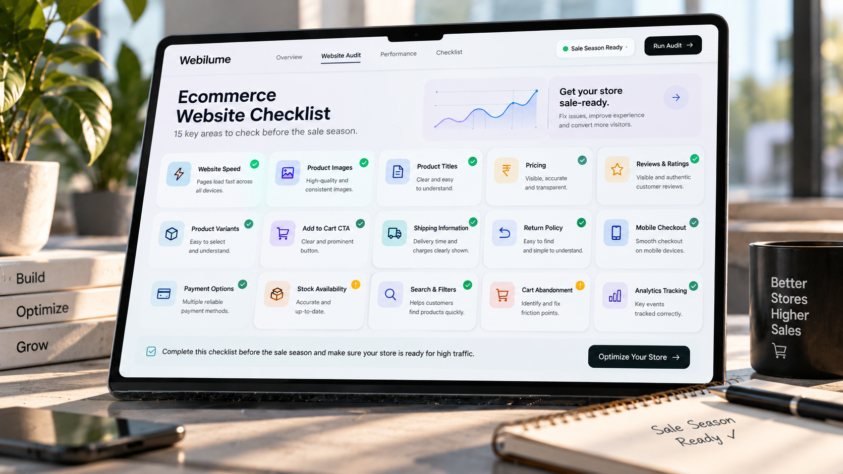
You cannot improve what you cannot measure.
Before the sale starts, verify that your key events are being tracked correctly.
At minimum, check important actions such as:
Product views
Add to cart
Checkout started
Purchase
Revenue
Conversion rate
Your tracking should work across the full customer journey.
Otherwise, you may finish the sale without knowing what actually worked.
Final Ecommerce Website Checklist
Before launching your next sale campaign, ask:
Is the website fast?
Are product images clear?
Are titles easy to understand?
Is pricing obvious?
Are reviews visible?
Are product variants simple?
Is the CTA clear?
Is shipping information easy to find?
Is the return policy clear?
Does mobile checkout work?
Are payment methods reliable?
Is inventory accurate?
Can customers find products quickly?
Do you know where carts are being abandoned?
Is analytics tracking correctly?
You do not need to redesign your entire store before every sale.
Sometimes, a few small fixes can remove the biggest points of friction.
Before You Drive More Traffic, Make Sure Your Store Is Ready For It.
A sale can bring thousands of visitors.
Your website decides how many of them become customers.
Need help reviewing your ecommerce website before your next campaign? Get in touch with Webilume.
Written by
Farhan Pathan
Hi, I'm Farhan Pathan — a creative developer and designer passionate about building modern digital experiences. I enjoy combining technology, design, and creativity to create products that are both visually engaging and highly functional. My focus is on developing user-friendly web applications and interactive experiences that solve real problems and deliver value. I constantly explore new ideas, tools, and technologies to improve my craft and bring innovative solutions to life. For me, great products are built at the intersection of thoughtful design, clean development, and a deep understanding of user needs.