
Beautiful Design Builds Belief: The Psychology of First Impressions
A website's first impression is shaped before visitors read a single paragraph. Learn how visual hierarchy, consistency, clarity, and thoughtful design influence trust and the way people experience a brand online.
 Farhan PathanOctober 1, 20264 min read
Beautiful Design Builds Belief
The psychology of a website's first impression.
Before someone reads your headline, checks your services, or clicks your CTA, they have already formed an initial impression of your website.
They notice the visual structure, typography, spacing, imagery, and overall feeling.
That first impression doesn't tell them everything about your business.
But it can influence whether they stay long enough to learn more.
A beautiful website isn't automatically a good website.
But thoughtful design can make a business feel clearer, more credible, and easier to understand.
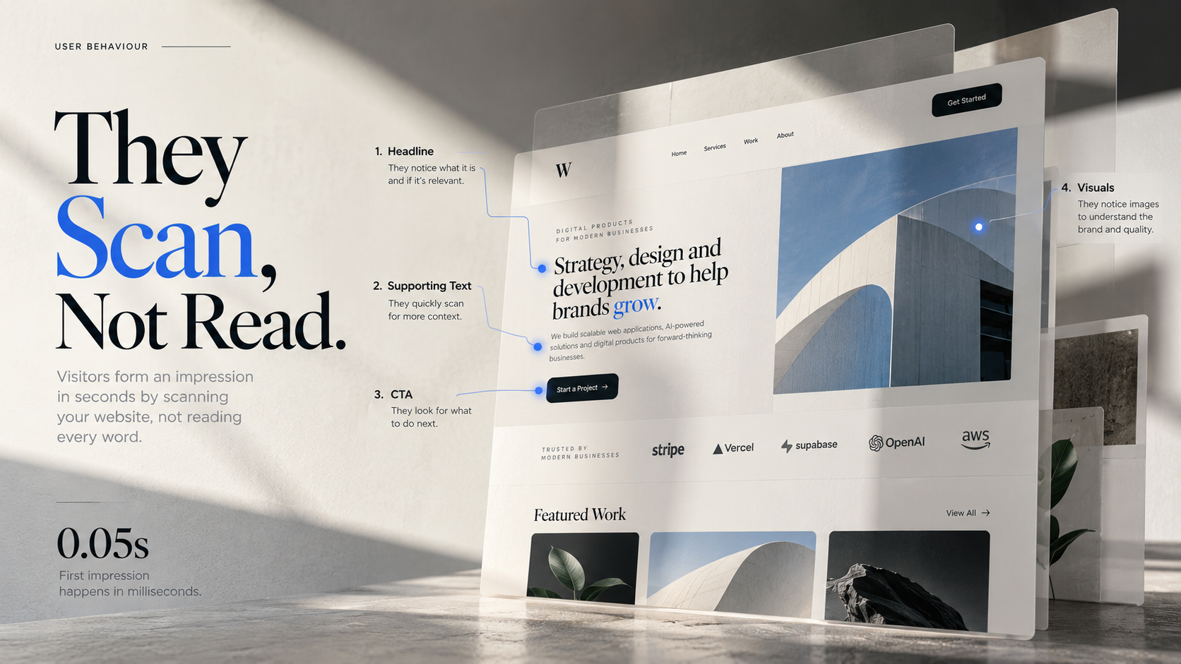
People Don't Read First. They Scan.
When someone lands on a website, they rarely start by reading every word.
They scan.
They're looking for answers:
What is this business?
What does it offer?
Is this relevant to me?
Can I trust it?
What should I do next?
Good visual hierarchy helps answer those questions without making the visitor work for them.
Typography establishes structure.
Spacing separates ideas.
Contrast draws attention.
Images provide context.
Every element should have a job.
When everything is equally loud, nothing feels important.
Why Beautiful Design Can Create Confidence
People often associate quality with signals that are easy to perceive.
A website that feels consistent and intentional can communicate that the business behind it is equally considered.
That doesn't mean adding more effects, animations, gradients, or decorative elements.
In many cases, the opposite is true.
Simple layouts can feel stronger because they remove unnecessary friction.
Clear navigation.
Consistent typography.
Useful imagery.
Strong spacing.
Focused messaging.
These details make an experience easier to process.
And when something is easier to understand, it can also feel easier to trust.
Design Is Communication at Speed
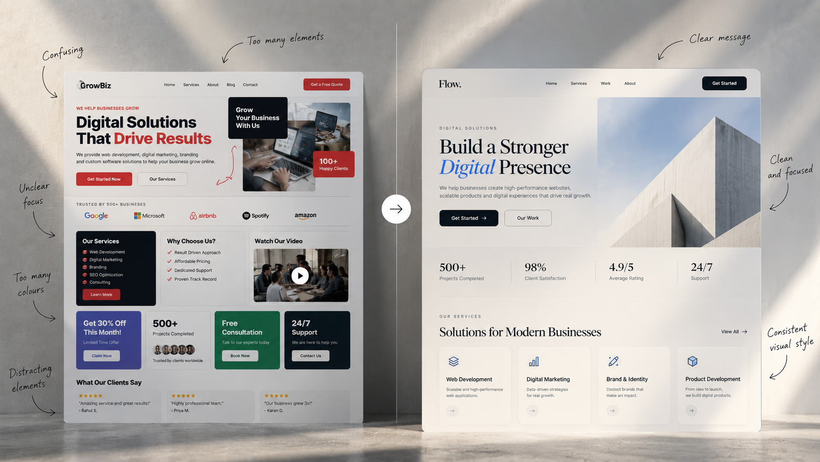
Imagine two websites offering the exact same service.
One opens with:
A clear headline.
A simple explanation.
Strong visual hierarchy.
One obvious next step.
The other has:
A crowded layout.
Vague messaging.
Inconsistent styles.
Several competing buttons.
The businesses may be equally capable.
The products may be equally good.
But the websites communicate very different levels of clarity.
That's why design shouldn't be treated as the final layer added after development.
Design is part of the communication system.
It determines what people notice first, what they understand next, and where their attention goes.
When Beautiful Design Still Fails
A polished website can still perform poorly when the underlying experience is unclear.
For example:
A beautiful homepage with a confusing headline.
A modern design with no obvious CTA.
Strong visuals with weak product information.
A premium layout that becomes difficult to use on mobile.
A consistent brand identity with no proof that the business delivers.
Good design cannot fix every problem.
It works best when visual quality and functional clarity support each other.
The Psychology Behind a Strong First Impression
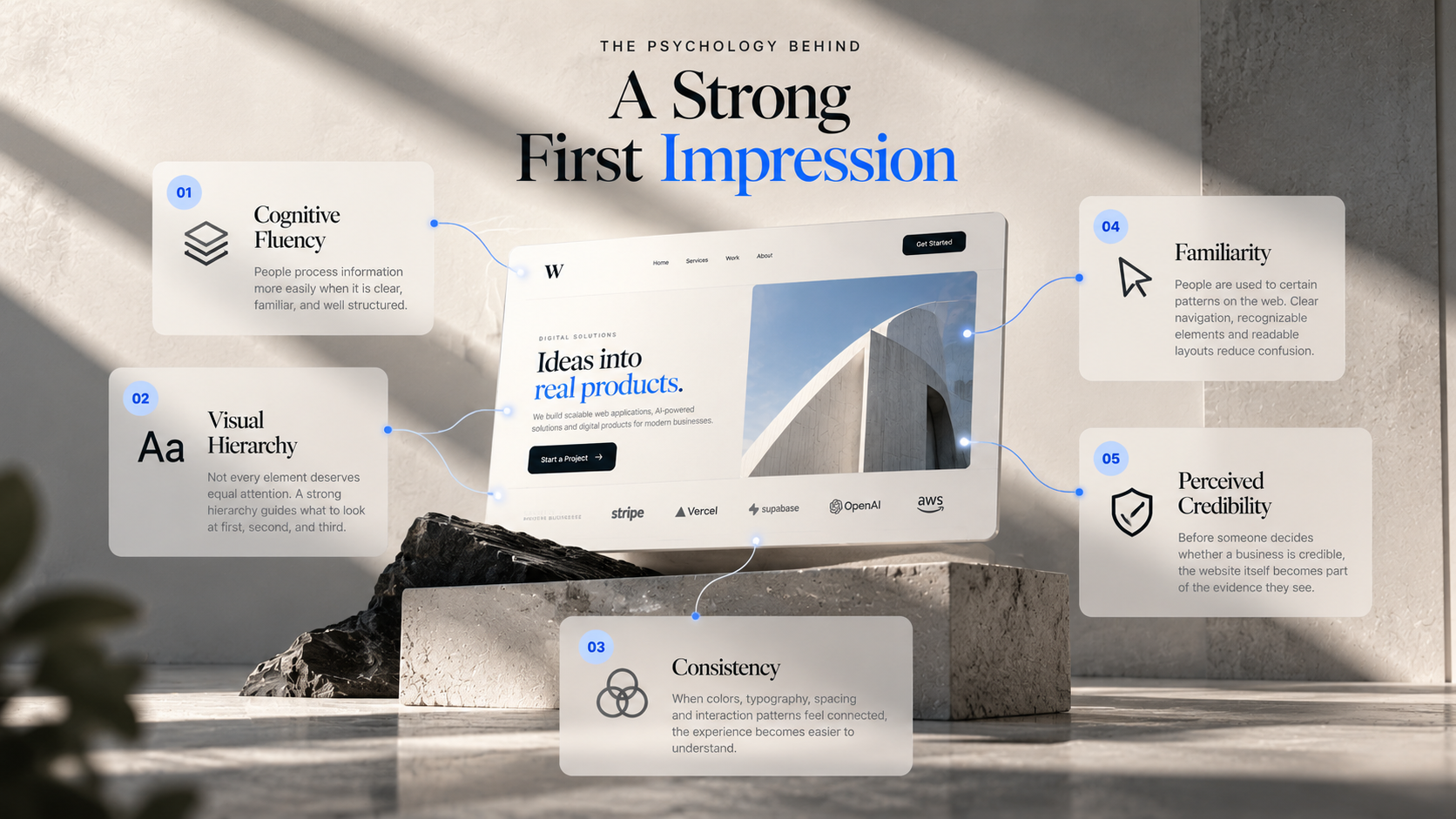
01 — Cognitive Fluency
People generally process information more easily when it is clear, familiar, and well structured.
Your website should make understanding feel effortless.
02 — Visual Hierarchy
Not every element deserves equal attention.
A strong hierarchy tells the visitor where to look first, second, and third.
03 — Consistency
When colors, typography, spacing, imagery, and interaction patterns feel connected, the experience becomes easier to understand.
04 — Familiarity
People are used to certain patterns on the web.
Navigation at the top.
Clear buttons.
Recognizable product cards.
Readable typography.
Breaking conventions can work.
But confusion is rarely the goal.
05 — Perceived Credibility
Before someone decides whether a business is credible, the website itself becomes part of the evidence they see.
That makes presentation important.
The Real Goal Isn't to Look Impressive
The goal is to make the right information easy to understand.
A strong website should make someone think:
I understand what this is.
I understand who it's for.
I know what to do next.
I feel comfortable continuing.
That's where beautiful design becomes useful.
It's not about making a website look expensive.
It's about making the experience feel intentional.
A Better Way to Think About Design
Instead of asking:
"Does this website look good?"
Ask:
Is it easy to understand?
Does the visual hierarchy match what matters?
Does the design reinforce the brand?
Can someone find what they need quickly?
Does the experience create confidence?
Good design isn't decoration.
It's clarity, structure, and communication working together.
And sometimes, the strongest first impression is the one that barely feels designed at all.
People may forget exactly what your website said.
They remember how confidently it made them feel.
Written by
Farhan Pathan
Hi, I'm Farhan Pathan — a creative developer and designer passionate about building modern digital experiences. I enjoy combining technology, design, and creativity to create products that are both visually engaging and highly functional. My focus is on developing user-friendly web applications and interactive experiences that solve real problems and deliver value. I constantly explore new ideas, tools, and technologies to improve my craft and bring innovative solutions to life. For me, great products are built at the intersection of thoughtful design, clean development, and a deep understanding of user needs.